世针针灸交流中心
Exchange Center of Acupuncture and Moxibustion
LOGO释义
LOGO interpretation
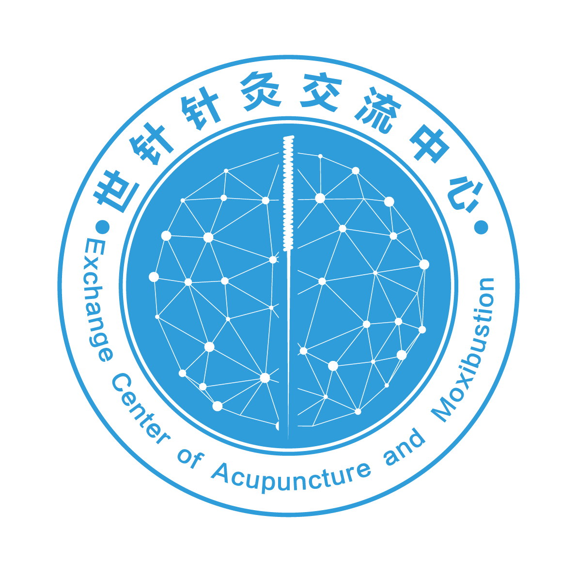
标志点与线连成球状,既代表着人体经脉和穴位息息相通,也寓意着针灸文化如浩瀚星辰博大精深,同时也象征针灸在网络互联的新时代里与时俱进,可以无地域和空间限制进行学术文化交流互通。
The symbolic points and lines are connected in a sphere, which not only represents the close connection of human meridians and acupoints, but also implies the vast and profound culture of acupuncture and moxibustion. At the same time, it also symbolizes that acupuncture and moxibustion are advancing with the times in the new era of network interconnection. Academic and cultural exchanges can be carried out without geographical and spatial constraints.
中间的银针,则清楚标示着主体所致力方向和主旨。
The silver needle in the middle clearly indicates the direction and purpose of the main body.
标志以地球圆形象征世界,代表着中医针灸积极开放的胸襟和创新的精神,将世针针灸交流中心在继承和发扬中医传统精华的同时,并肩中医走向世界的使命与任务展现出来。 The symbol symbolizes the world with the earth's circle, represents the active open mind and innovative spirit of acupuncture and moxibustion in TCM. While inheriting and carrying forward the essence of traditional Chinese medicine, the Exchange Center of Acupuncture and Moxibustion will shoulder the mission and task of TCM going to the world.
标志色调以蓝色为基础色,白色相称,既简单大方又鲜明醒目,表现出中医针灸博大精深、蓬勃向上的发展态势。
The symbolic tone is based on blue and white, which is simple, generous and striking, showing the broad and profound development trend of acupuncture and moxibustion in traditional Chinese medicine.


